GOAL: BUILD YOUR 1ST DASHBOARD
In this guide, you will install and build a simple dashboard using Rocket.BI . This is the dashboard:
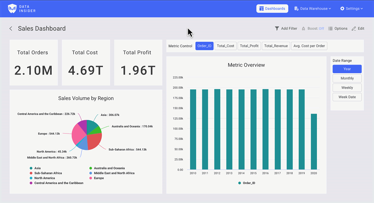
You can checkout the Dashboard via this link.
INSTALL
Start RocketBI with our pre-built docker images.
Get docker-compose.yml and configuration file:
wget https://raw.githubusercontent.com/datainsider-co/rocket-bi/main/docker/docker-compose.yml
wget https://raw.githubusercontent.com/datainsider-co/rocket-bi/main/docker/.clickhouse.env
Edit .clickhouse.env, add clickhouse server information.
Start RocketBI by run command: docker-compose up -d .
Open browser, go to localhost:5050, login with this account: hello@gmail.com/123456
To build from source or advanced configuration you could check it here Rocket.BI Readme
LET'S BUILD THE DASHBOARD
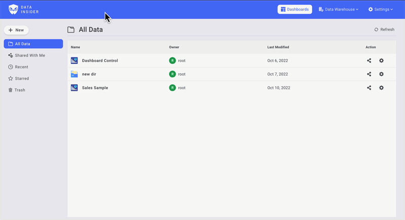
In Dashboard, you will find your reportings, start visualization by clicking +New You can build unlimited dashboards & draw unlimited charts in a dashboard.
See hi-res tutorial on Youtube: https://www.youtube.com/watch?v=TMkdMHHfvqY
Build the Chart Controls
Create a Metrics Control
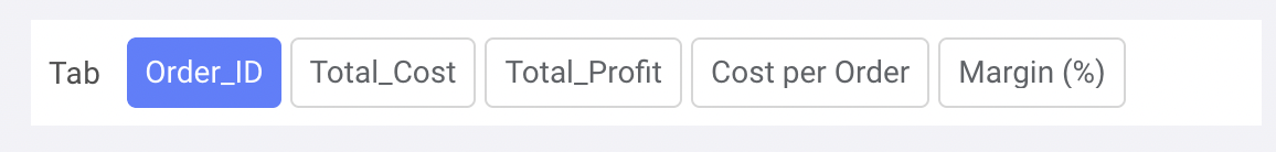
In the Tab filter, select metric fields you want to use. Make sure to keep check on aggregation setting.
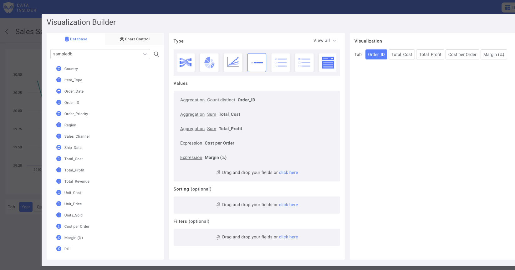
Rename filters & Save Control to Dashboard
Create a Date Type Control
Choose a Date field as Main Date column:

Add duplicate variants with different lookup ranges. For example, Year, Monthly, Daily date or Day of Week.
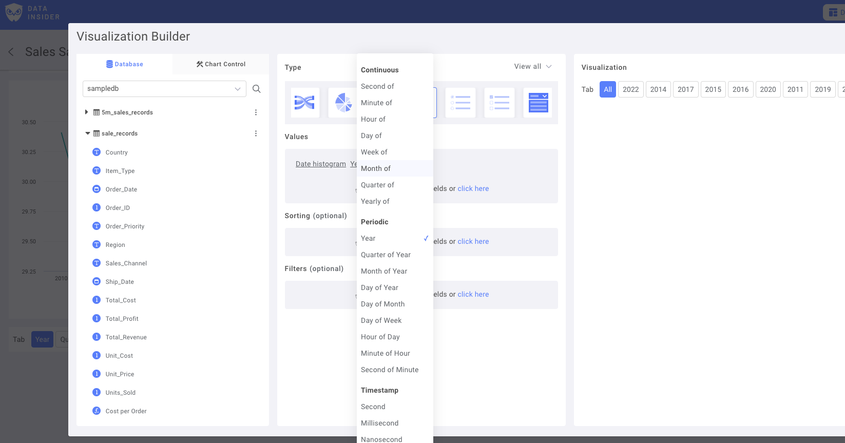
Rename filters & Save Control to Dashboard
Now, let build the Charts
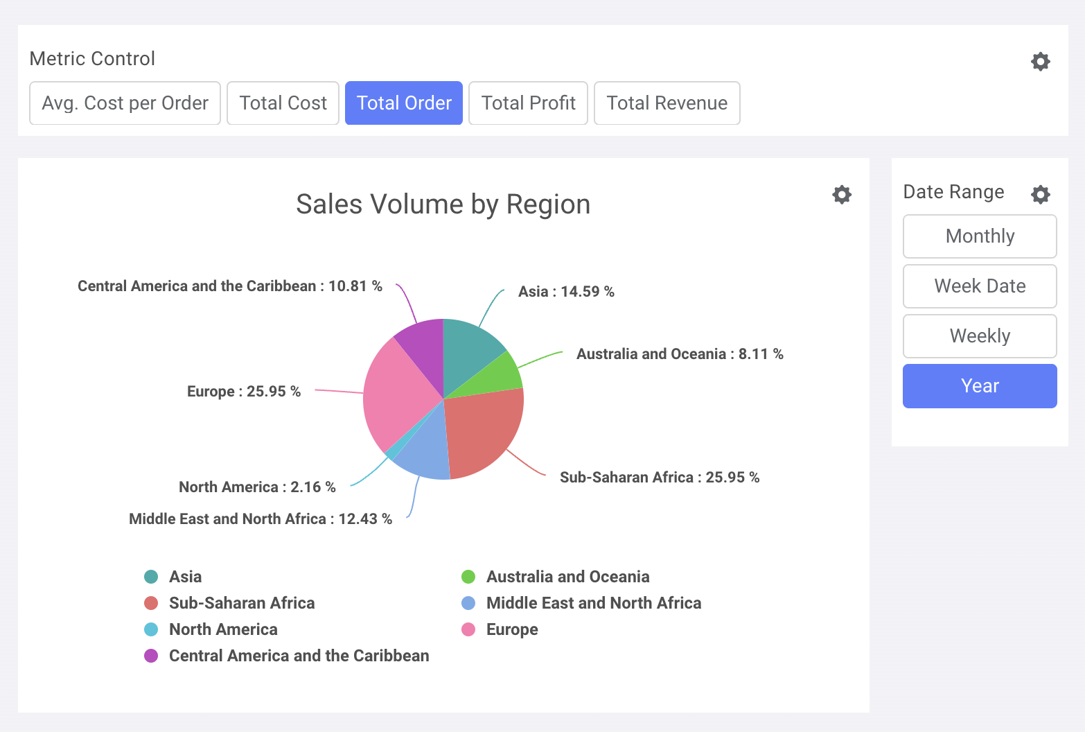
Pie Chart: Sales Metrics by Regions
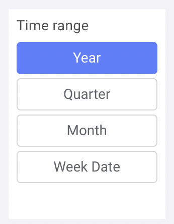
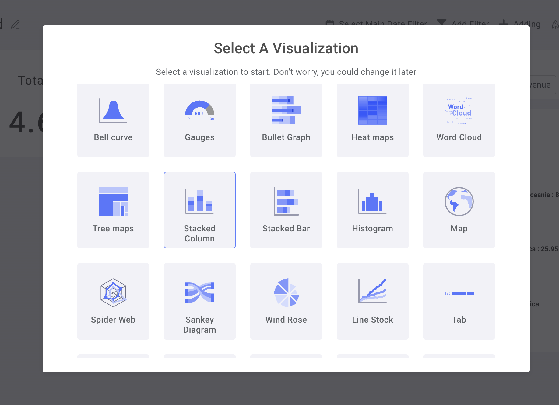
Choose Adding new chart, then Select Pie Chart
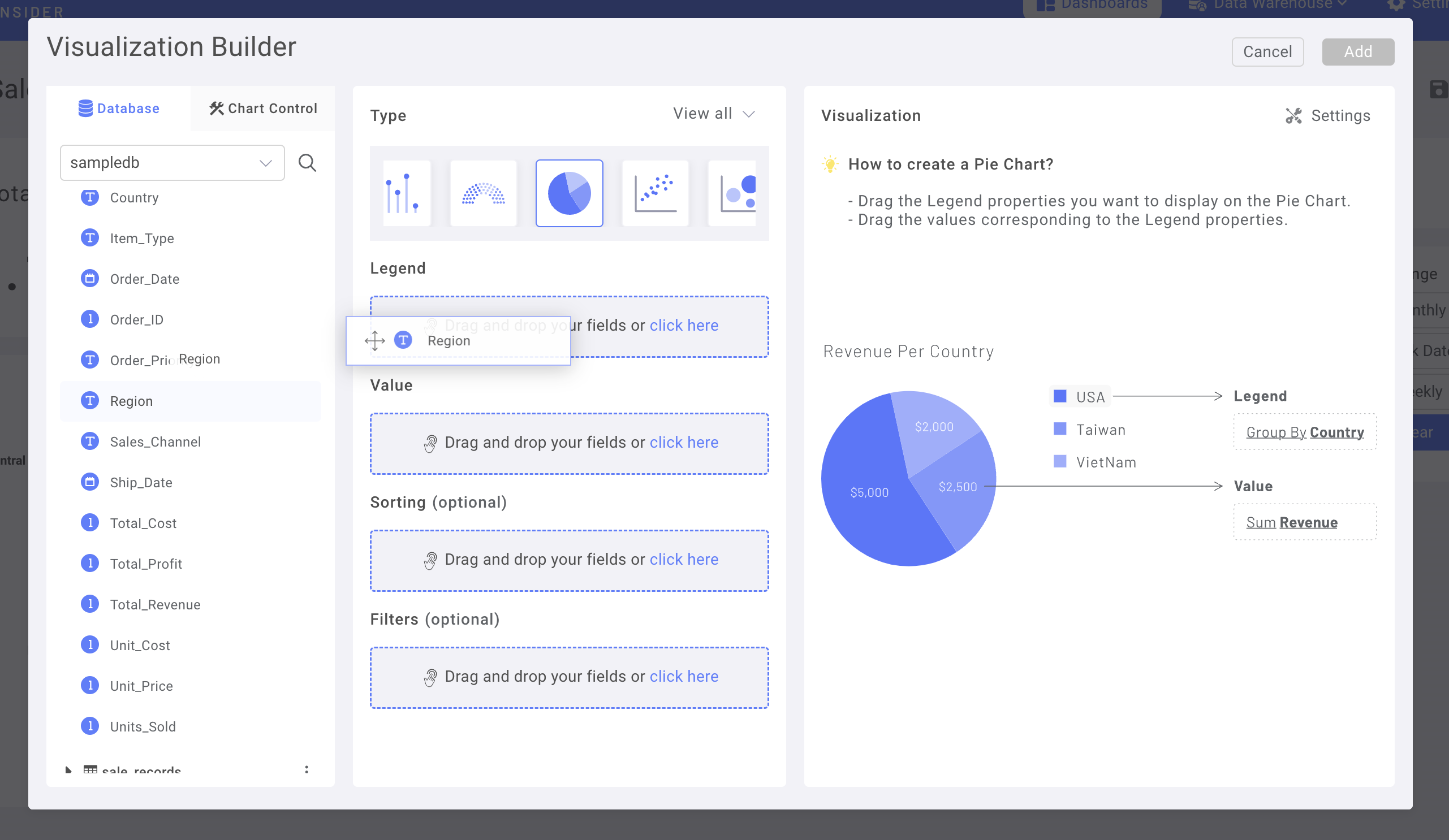
First Drag & Drop the column "Region" from the Dataset to Lengend Field
Then, change to Chart Control Tab
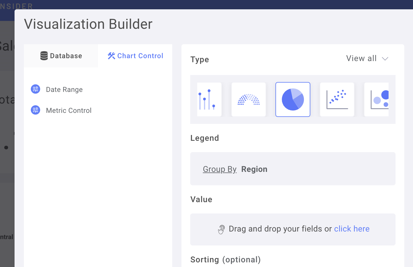
Drag & Drop the Metrics Control into Value Field
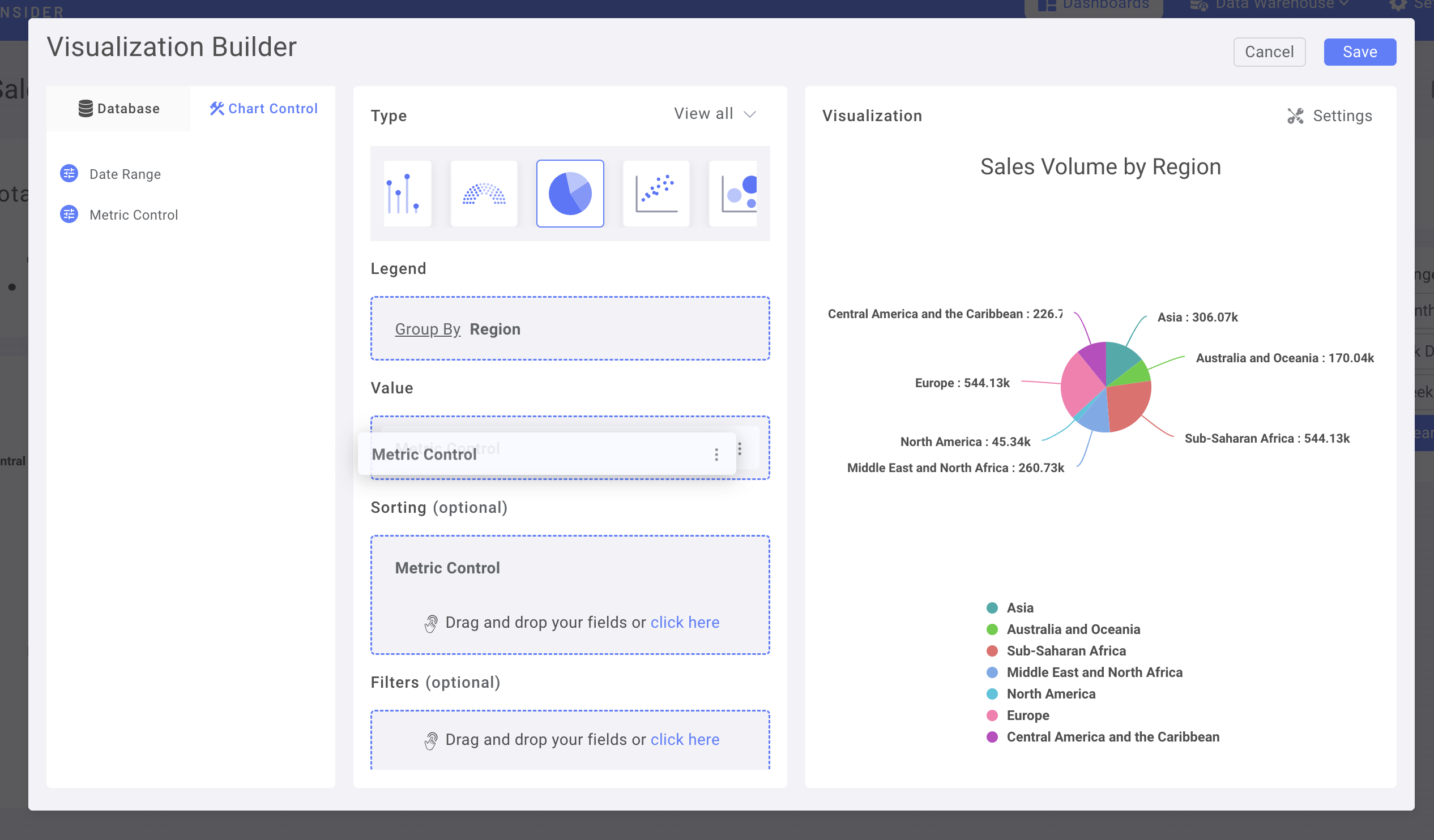
(you can also use Metrics Control as Sorting)
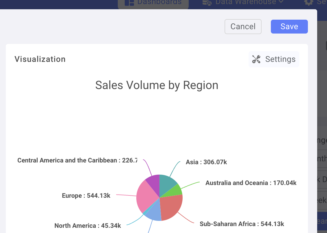
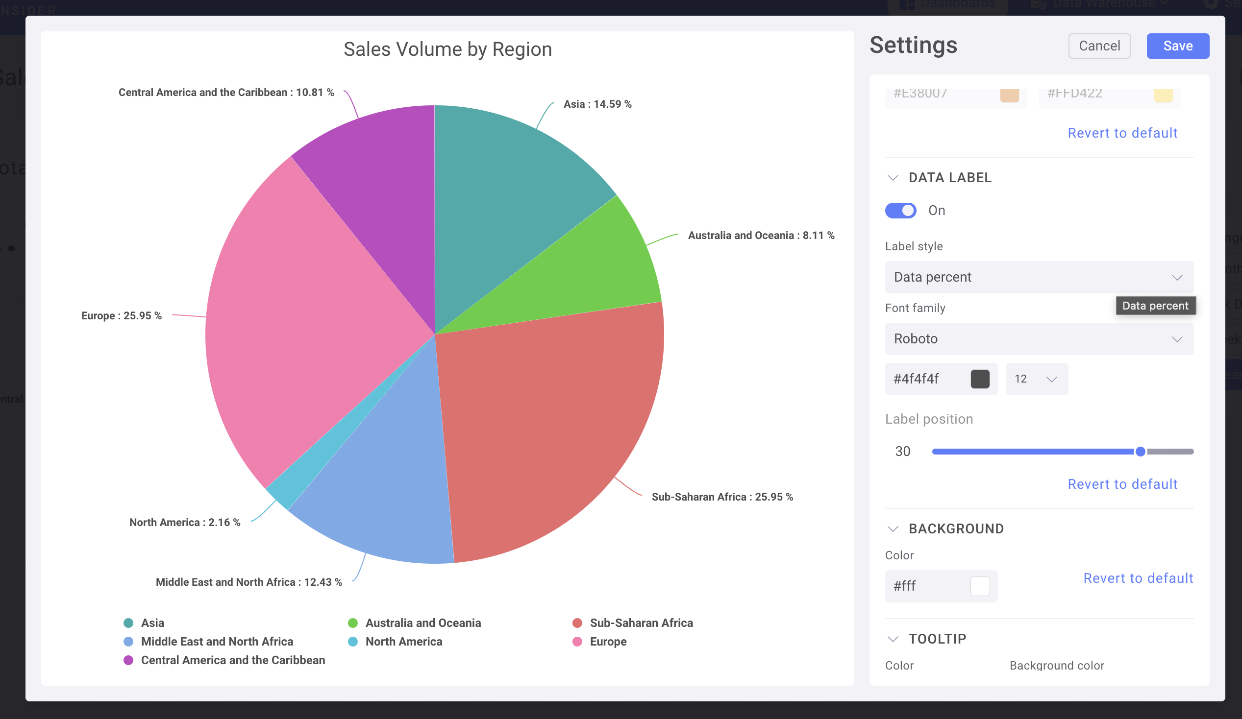
Navigate to Chart Setting for further customization
For example, change Data label to Percentage
Save & Add the Chart to Dashboard
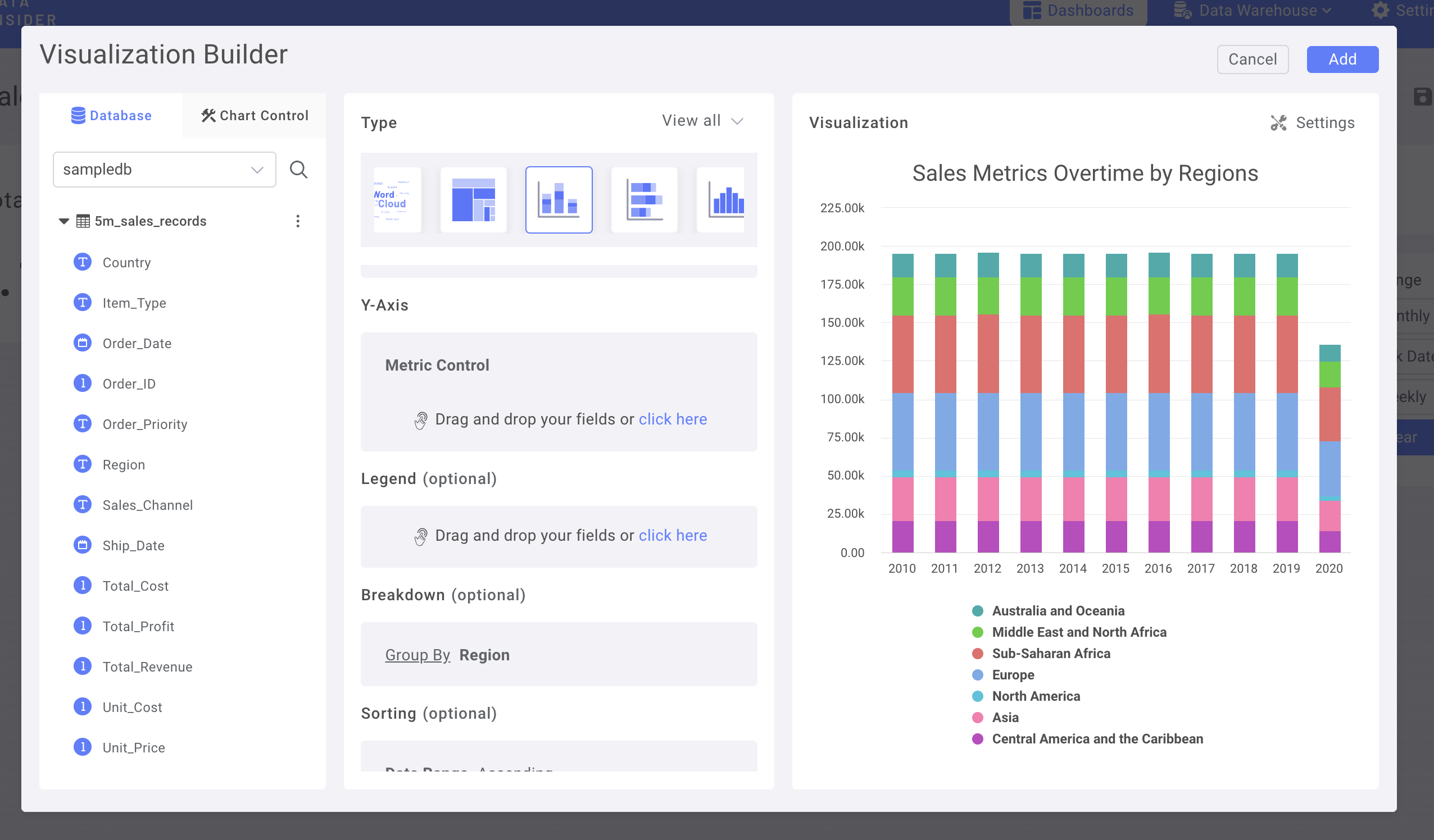
Use Date Control in a Time-series Chart
Let Use a Stacked Column Chart
In Chart Control, use Metrics Control as Y-axis & Date Range as X-axis
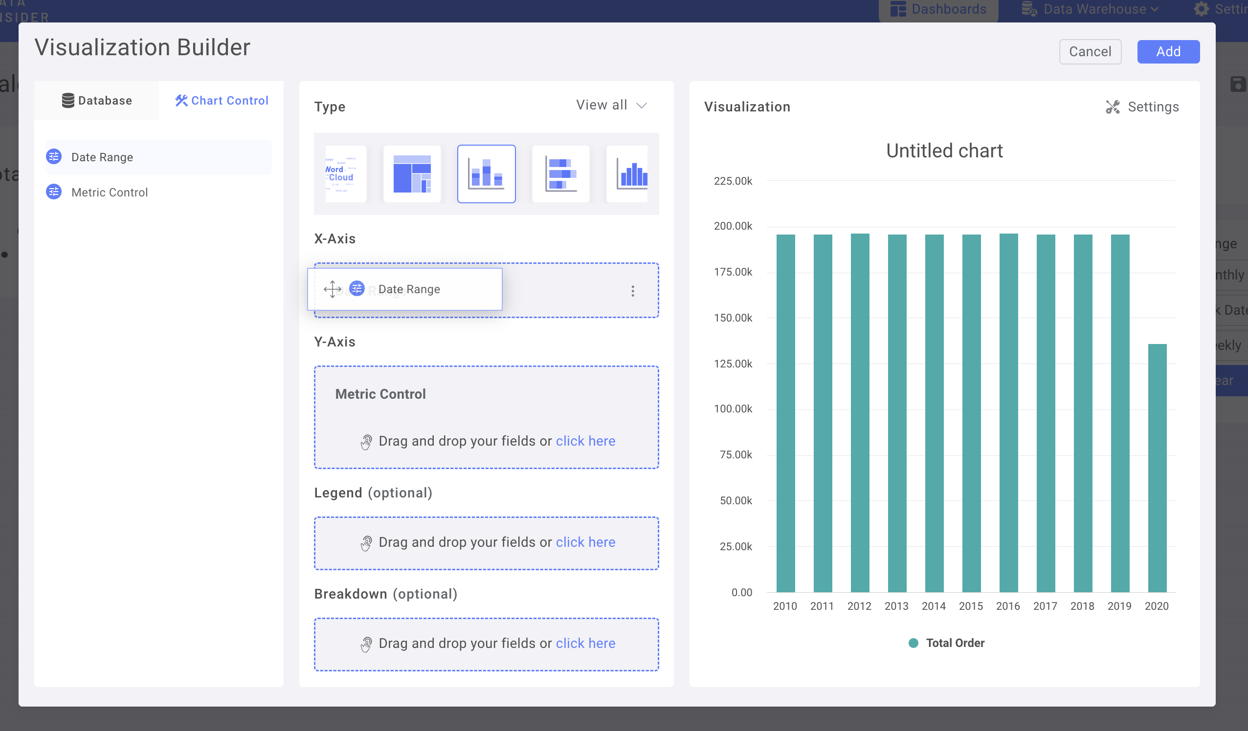
Add Region column in to Breakdown
Adding Number Chart as KPIs & glare-up the Dashboard
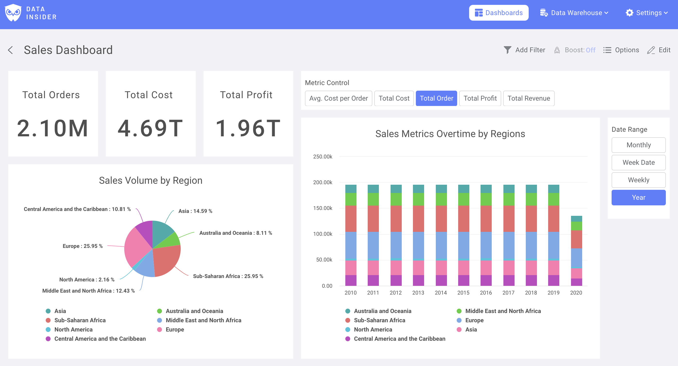
Now, you had successfully build your 1st dashboard with rocket.BI